July Collection
July brought more than just a new collection—it brought a full brand shift. Midway through the month, new company leadership stepped in, ushering in a cleaner, more minimalist visual identity with simplified layouts, lighter typography, and generous white space. The change happened fast, and we had just one week to pivot all remaining content to the new look and feel.
The “Global Traveler” collection leaned into warm, sun-soaked editorial imagery, which paired naturally with the updated, more restrained design direction. I’m showcasing two emails here:
The first, a “Prints” email, shows a before-and-after of the rebrand. The pre-rebrand version featured bold graphic treatments inspired by the hero product, while the post-rebrand redesign simplified the composition, reduced type weight and size, and let the imagery breathe.
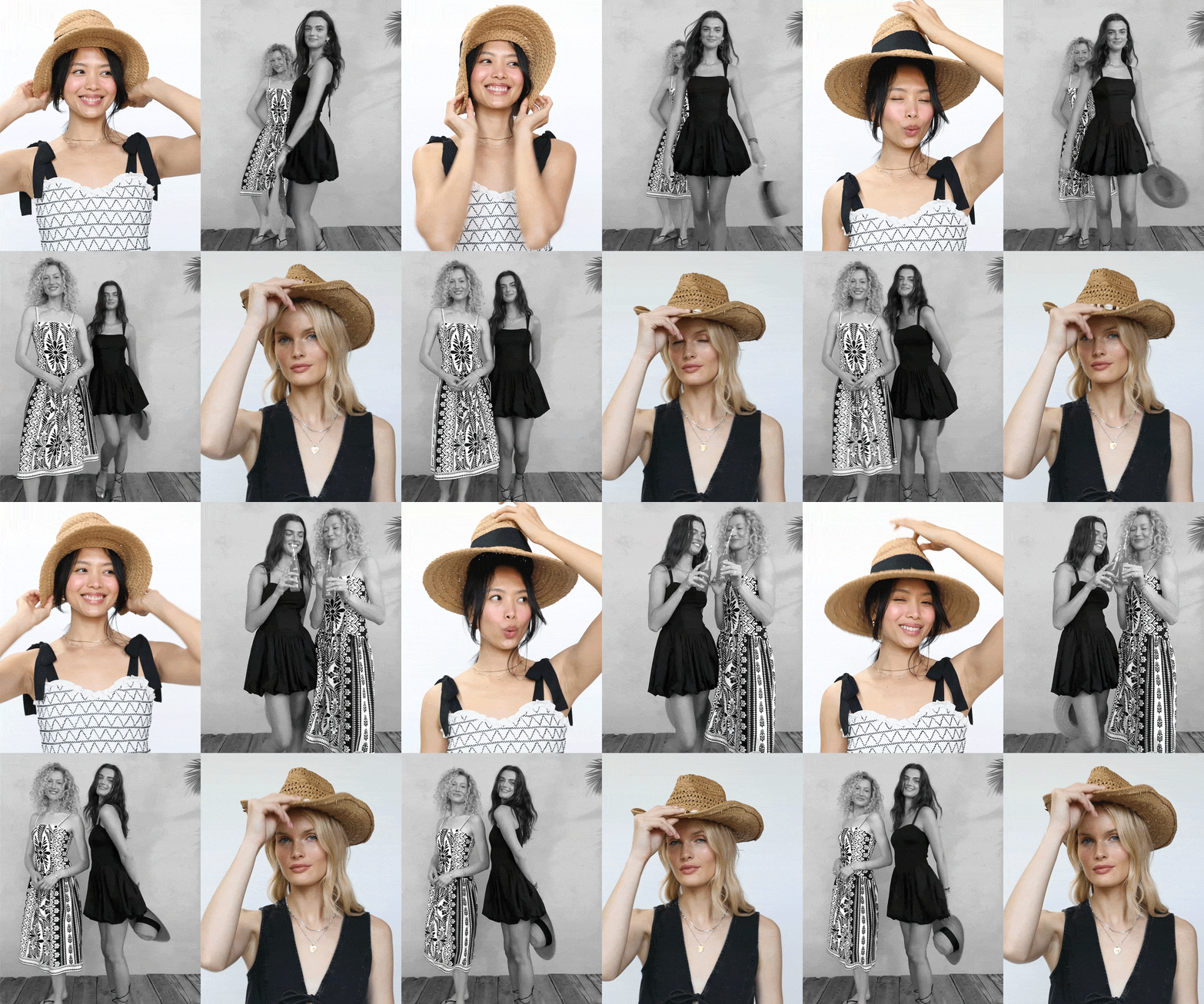
The second, “Black and White,” was a post-rebrand concept designed to spotlight the collection’s neutral pieces alongside new, emotive studio shots. While graphic treatments were pared back, I used a simple animation to showcase more product in a way that felt elevated rather than crowded—aligning with the new emphasis on personality and restraint over sheer product volume.
Note: Some GIFs have been compressed for web display; original assets maintain sharper detail and accurate color.
“Prints” Email
“Black and White” Email (Still)
“Prints” Email Draft
‘Black and White’ Email Body GIF
“Black and White” Email Social GIF


